ANALYTICS
A cross-industry selection of metrics dashboards created during my tenures at Costco Business Centers, Disney, and T-Mobile, designed to surface key insights and give stakeholders a clear, at-a-glance view of performance.
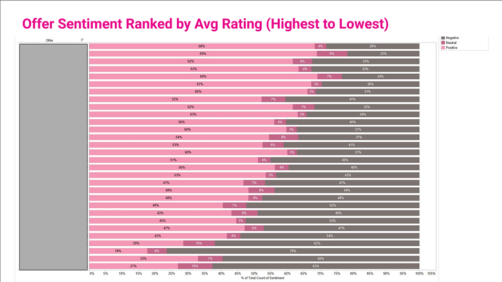
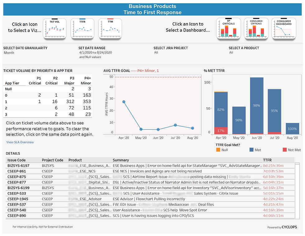
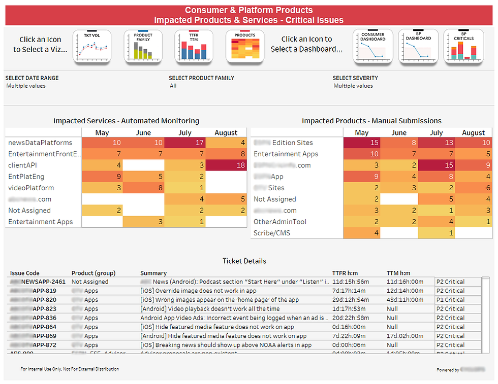
ISSUE MANAGEMENT
A few sample visualizations built in Tableau for product engineering teams to measure performance against SLAs and investigate trends in critical issues. Findings are used to push for improvements in process and product stability. The dashboards were created to replace a manually created report which not only simplified the preparation process but established consistency in reporting. Automation allowed for better dynamic scalability, enabled a live data connection, and flexible visualizations. Not pictured: Time to Mitigation, Ticket Volume, and Impacted Product Families.
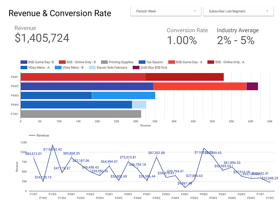
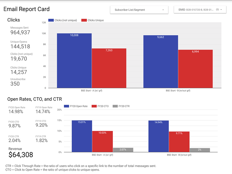
EMAIL CAMPAIGNS
This dashboard was built in Google Data Studio to display and analyze email campaign performance, KPIs, and A/B test results. Performance can be compared week-over-week and year-over-year. Industry averages are also provided as a benchmark for comparison. The dashboard was linked to a metrics tracking Google Sheet, which allowed newly entered data to appear once refreshed.

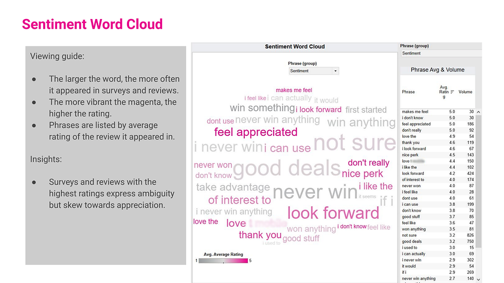
CUSTOMER SENTIMENT
This analysis was built in Tableau and used short answer text responses from an in-app survey to quantify customer sentiment through the measurement of key words and phrases. The words and phrases were also linked to the numerical customer rating given to act as a measure. Example: survey responses that included the phrase “love (company name)” occurred 150 times in the given time period and had an average rating of 4.4 out of 5 stars.